Stakeholder groups
- Teachers using the reading system for recurring exam workflows
- Product teams responsible for functional clarity and future changes
- Developers and QA teams affected by handoff quality and repeated implementation work
Case study
O2O exam reading system redesign
I took on this redesign when the O2O Exam Reading System had become hard to navigate, hard to maintain, and unclear for the teachers using it. Instead of treating it as a visual refresh, I reframed it as a workflow and product-structure problem: the system logic had become too fragmented, key paths were difficult to understand, and the design-production model itself made engineering changes expensive. My work focused on diagnosing the real workflow failures, rebuilding the information structure, simplifying the teaching-side interaction model, and shifting the team toward a more componentised way of designing and delivering the product.
I approached this as a multi-sided workflow problem, not only as a teacher-facing UI issue. Teachers needed faster orientation, clearer task progress, and less cognitive load in the reading process. The product team needed a structure that was easier to evolve. Engineering and QA needed a more reusable and stable interface logic so every change would not trigger repeated handoff and implementation friction.
To make the redesign meaningful, I first diagnosed where the product was actually failing. I reviewed the end-to-end task structure, checked where users lost context, mapped which navigation layers were overloaded, and identified where the interface and production model were creating repeat work. That let me define the project as a workflow redesign, an information-architecture redesign, and a delivery-efficiency redesign at the same time.
Before the redesign, the product had accumulated too many entry points and too little state clarity. Teachers could technically complete the workflow, but they often had to remember where functions were, infer what step they were in, and re-learn navigation from screen to screen. The problem was less “missing functionality” and more “too much structural noise around existing tasks.”
That same structural mess also affected internal teams. Because layout logic and components were inconsistent, every change created extra discussion, extra restoration work in development, and more avoidable QA effort. The user problem and the delivery problem were the same structural problem showing up in two places.
When I took over the project, the system already had the functions it needed on paper, but the actual workflow felt confusing and heavy. Teachers struggled to find the right entry points, the reading process was difficult to follow, and the system often failed to show users where they were or what they had completed.
The problem was not only on the user side. The interface style was inconsistent, interaction patterns were not unified, and the design approach was not componentised, which meant later development changes were also costly and inefficient. I therefore defined the work as both a usability redesign and a structural redesign for delivery.
Strategy 1
I prioritised the parts of the system that were creating orientation problems first. That meant simplifying navigation, clarifying hierarchy, and reducing the number of competing choices before investing in detailed visual refinement.
The core question was not “how do we make this look better?” but “how do we help teachers know where they are, what they need to do next, and how to finish a task with less confusion?”
Strategy 2
I treated inconsistent controls, unclear states, and mixed layout logic as a product problem. By standardising recurring patterns, I reduced the amount of interface interpretation users had to do from screen to screen.
This also made the system easier to extend later, because new pages could reuse the same interaction logic instead of inventing new rules each time.
Strategy 3
I did not separate design quality from delivery efficiency. The component library, page standards, and layout rules were part of the product strategy because they reduced communication cost, handoff ambiguity, and repeated engineering effort.
This made the redesign more sustainable: the team could move faster without recreating the same pages and arguments every time the system changed.
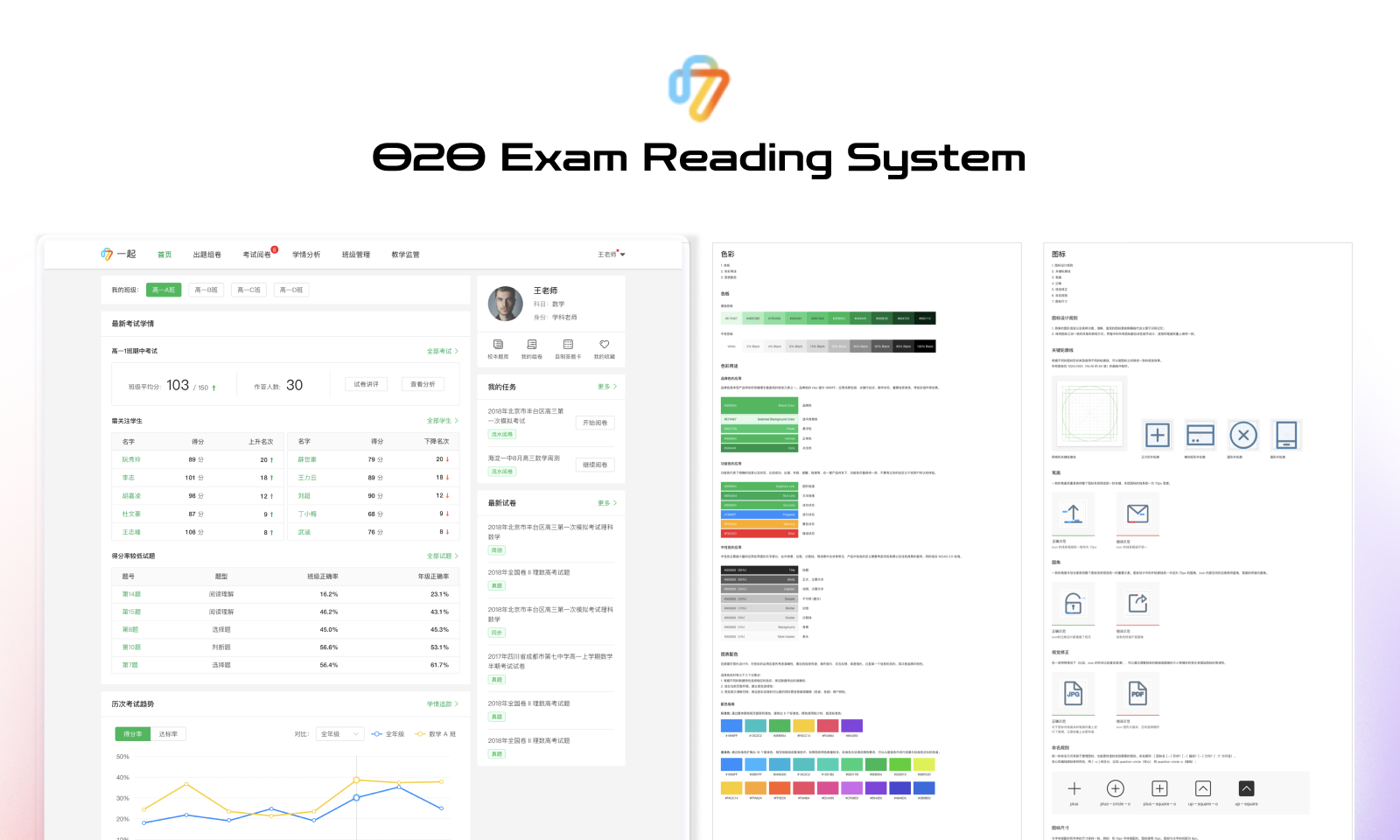
One of the clearest structural changes was reducing the top-level menu from 15 first-level menus to 7. This was not only a simplification exercise. It was a way to reorganise the product around what users were actually trying to do rather than how the old system had accumulated features.
I also added a left-side navigation structure to solve the long-page problem and make it easier for users to see charts and related data tables within one screen. In practice, the new grouping moved the structure closer to real teacher tasks instead of scattered feature accumulation, so the interface offered fewer but more useful choices and made the workflow easier to scan and complete.


I unified the color system. Before the redesign, one website used six different shades of green. After the redesign, the system used one clear main color.
I also unified component style. Before the redesign, component styles were inconsistent and their application scenarios were not clear enough. After the redesign, the style was unified into three clear scenarios: selected, unselected, and mouse-hover states.
In page structure, I unified the page style and layout, moving from inconsistent left-right and top-bottom patterns toward a more consistent layout system. I also standardised the use of cards as the modular unit of page division.


The collaboration impact became visible once the team no longer had to redesign or reinterpret every page from scratch. PMs could align around reusable patterns, developers had clearer restoration targets, and QA no longer had to evaluate every new page as if it were a different design language. That is where the component strategy started to pay off as a team workflow improvement, not only as a design-system decision.


This project taught me that redesigning a workflow is not the same as cleaning up screens. One early risk in work like this is improving visual consistency without solving the deeper navigation and handoff problems that are making the product hard to use and hard to evolve.
I learned to be more explicit about diagnosis before solutioning: what is actually broken for users, what is creating maintenance drag for teams, and which structural problems have to be solved before interface polish becomes meaningful.
That lesson still shapes how I work now. In complex products, the real design work often starts one layer below the screens, in workflow structure, reusable patterns, and delivery logic.
How UX decisions connect to commercial goals and conversion logic in an education product.
The middle-school teacher and student products I worked on were part of the 17zuoye product ecosystem. This public download page shows the product surface within that ecosystem.