Interactive teaching whiteboard 8.0 and multi-screen interaction 2.0
I joined this product line as a UX designer when HiteVision's education software was under pressure from more experience-led competitors. The problem was not simply that the software lacked features. The deeper issue was that many useful teaching capabilities were not being fully delivered in real classrooms because the interaction logic did not fit actual teacher behaviour. My role was to go into real teaching scenarios, identify why usage diverged across teacher groups, and turn those findings into clearer interaction, better feature delivery, and more usable classroom workflows.
Product line
Pie.EXE - Powerful, Interactive, Education
Main projects
Interactive Teaching Whiteboard 8.0 and Multi-screen Interaction 2.0
My role
UX designer with ownership across field research, interaction definition, prototyping, iteration, testing, and launch support
Methods
Contextual inquiry, stakeholder mapping, behavioural segmentation, interaction modelling, and data instrumentation
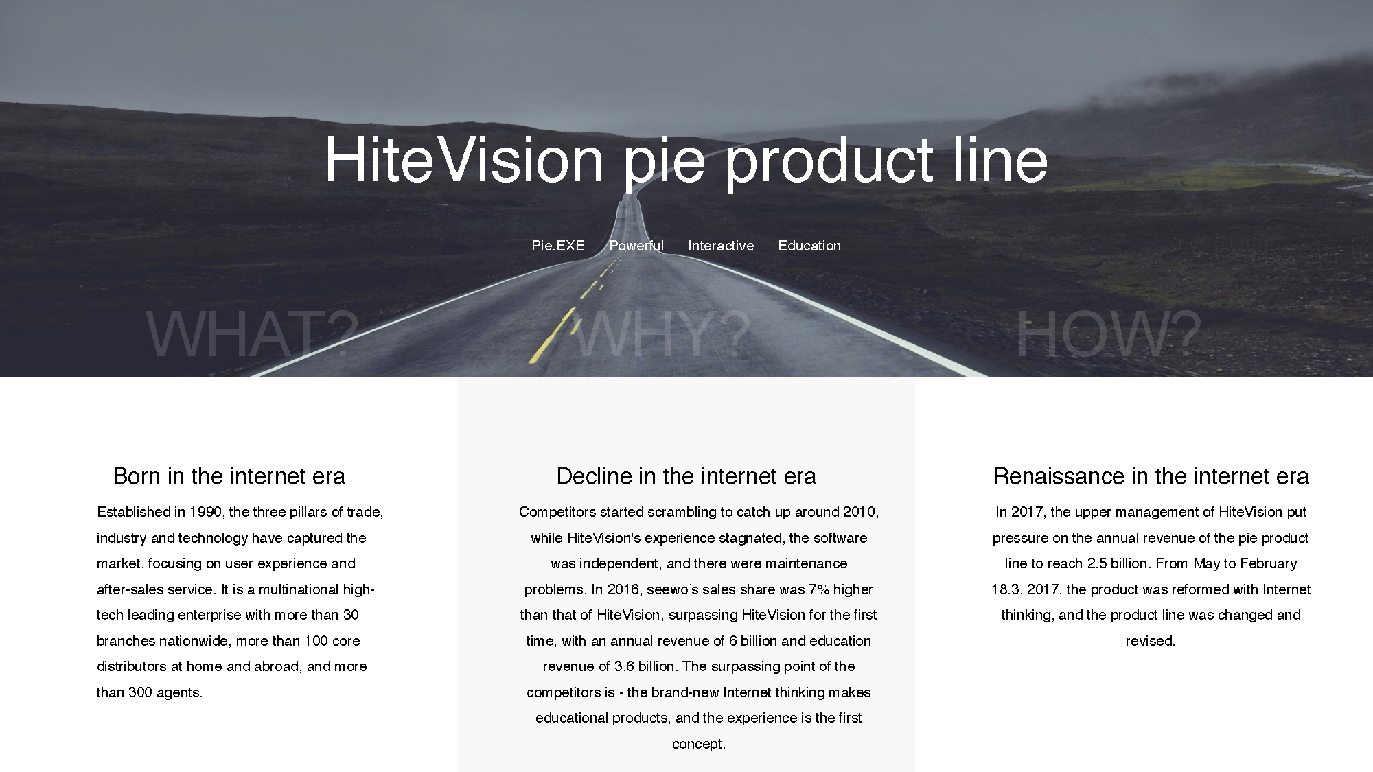
Industry context and business pressure
Around 2010, competitors began catching up rapidly. While HiteVision still had scale and market presence, competing products were moving faster with more experience-first product thinking.
Under that pressure, the Pie product line was revised and restructured. My task was not just to polish screens, but to help diagnose why the product line was underperforming in actual use and where interaction changes could improve classroom adoption.
The redesign work happened under direct competitive and business pressure, not only as a design refresh.
Interactive Teaching Whiteboard 8.0
Product scope
Users: K–12 teachers across all subjects
Contexts: lesson preparation (PC) and live classroom teaching (interactive display)
Platform: Windows PC and HiteVision large-format interactive display
Scope: 21 redesigned functional modules — including 4 new classroom activity types, 5 utility tools, and comprehensive interaction specifications across core elements
Design direction
Reduce interface complexity and visual noise
Eliminate redundant interaction paths
Consolidate linear workflows into fewer, clearer steps
Lower the adoption threshold for less confident classroom users
Role and scope
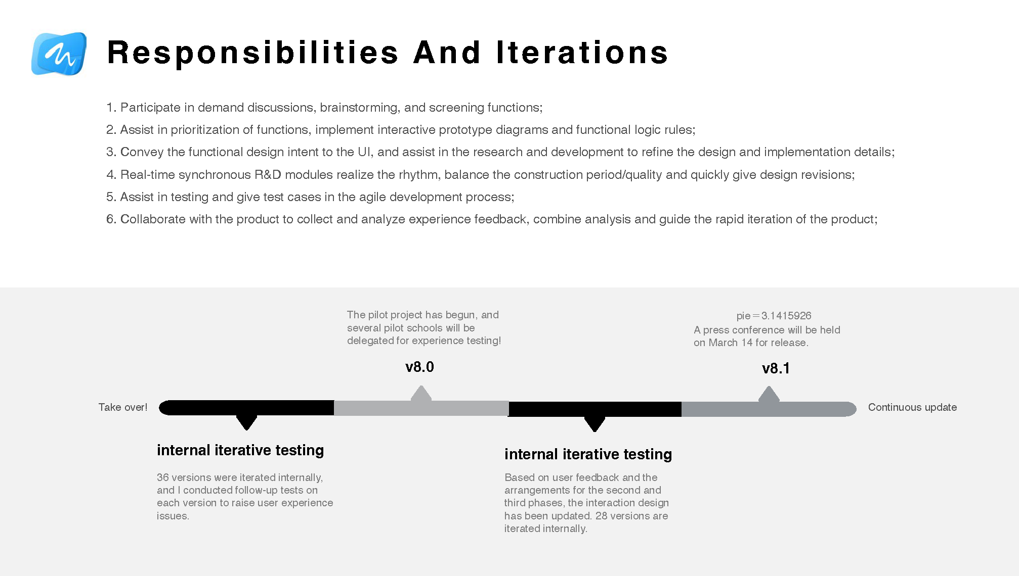
Within a cross-functional team of 30+ engineers, 6 product managers, and 4 QA, the design function comprised 3 interaction designers and 3 UI designers — each interaction designer owning a separate product stream under shared delivery pressure. I held UX ownership of Whiteboard 8.0, the highest-priority line in the portfolio.
My responsibilities spanned the full design cycle: contributing to requirements reviews and feature prioritisation, producing interaction prototypes and flow logic, briefing the visual designer on interaction intent and handoff specs, collaborating with engineering to resolve implementation edge cases, and iterating through multiple release cycles with test-case support and design QA. Following the first release, I onboarded and guided a junior interaction designer as the team scaled for subsequent iterations.
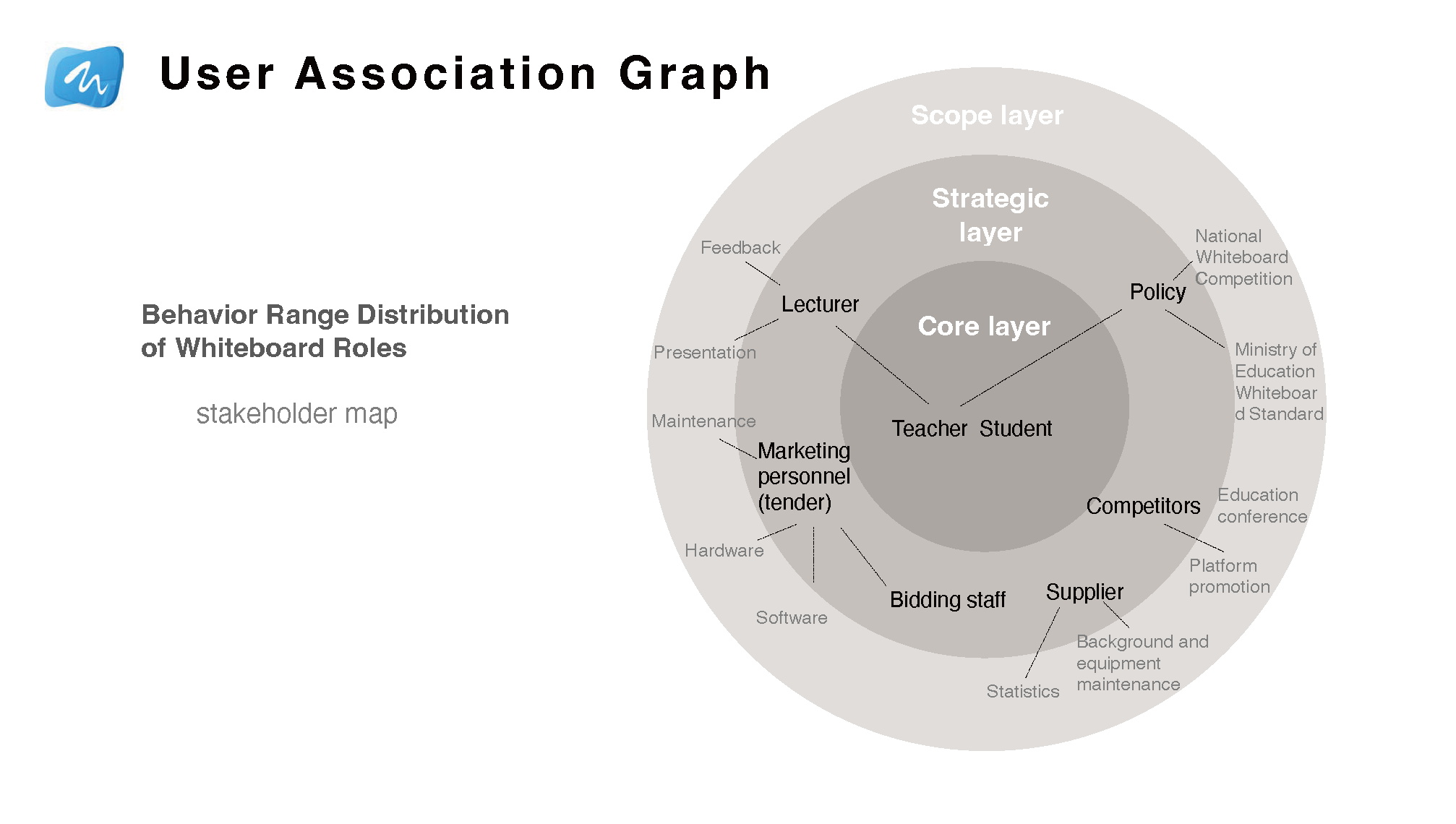
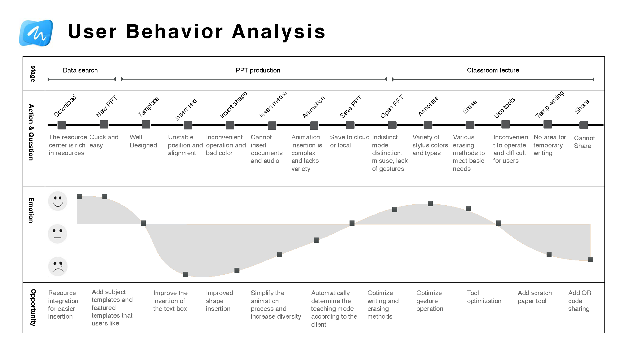
I worked from stakeholder maps, user behavior analysis, questionnaires, and scenario analysis to understand both the teaching environment and actual classroom operations. The most important part of this work was going back to real teaching contexts instead of treating all teachers as one user group.
What I found was that the issue was not only feature richness. Younger teachers and teachers in more developed regions were much more willing to explore interactive tools, while many teachers in less developed areas treated the large screen more like a projection surface. The same product therefore had very different levels of feature delivery depending on the teaching context.
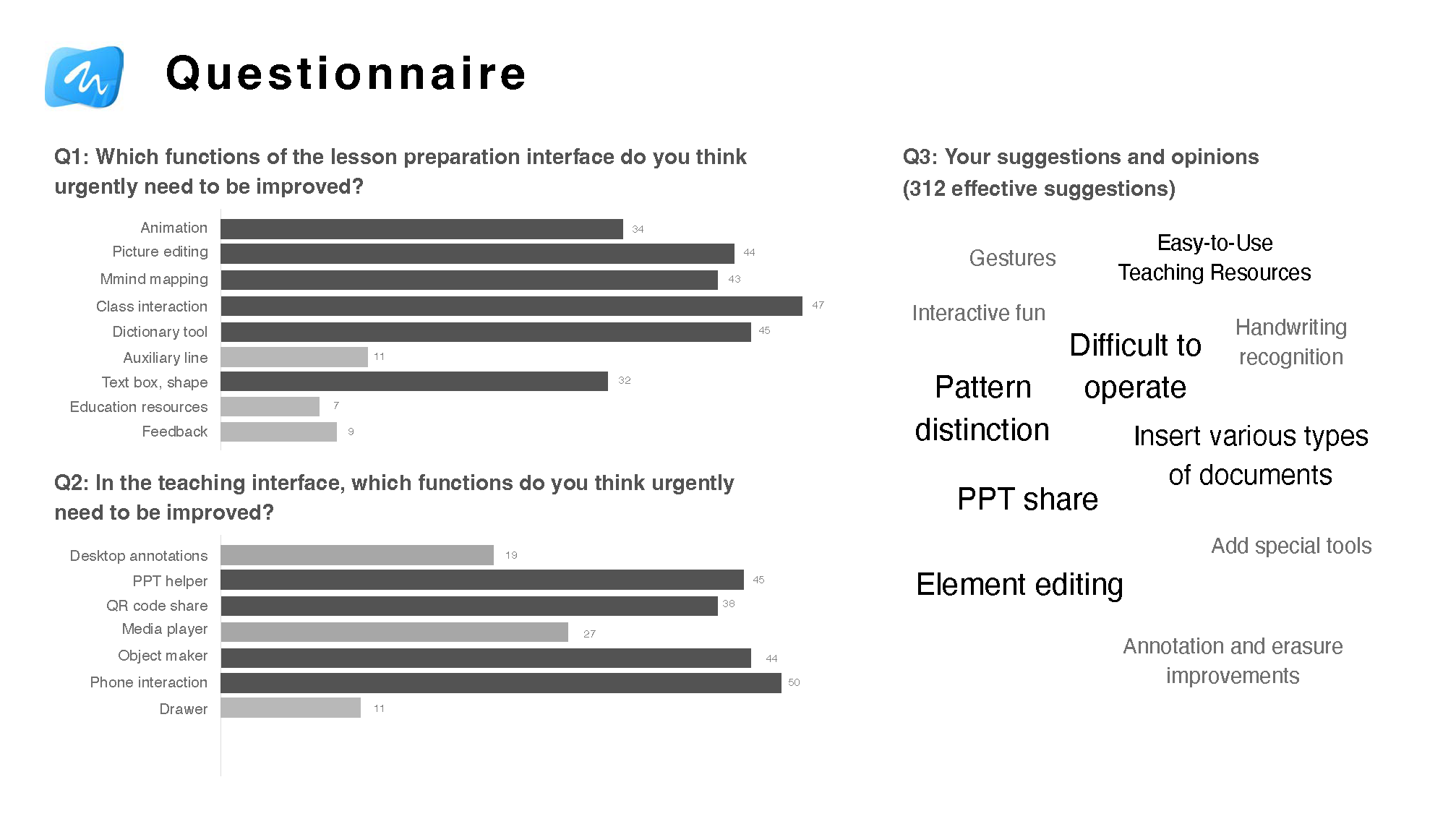
312 valid responses collected from teacher questionnaires.
The core research question was not what features were missing — it was why existing features were failing to deliver value in real classroom conditions.
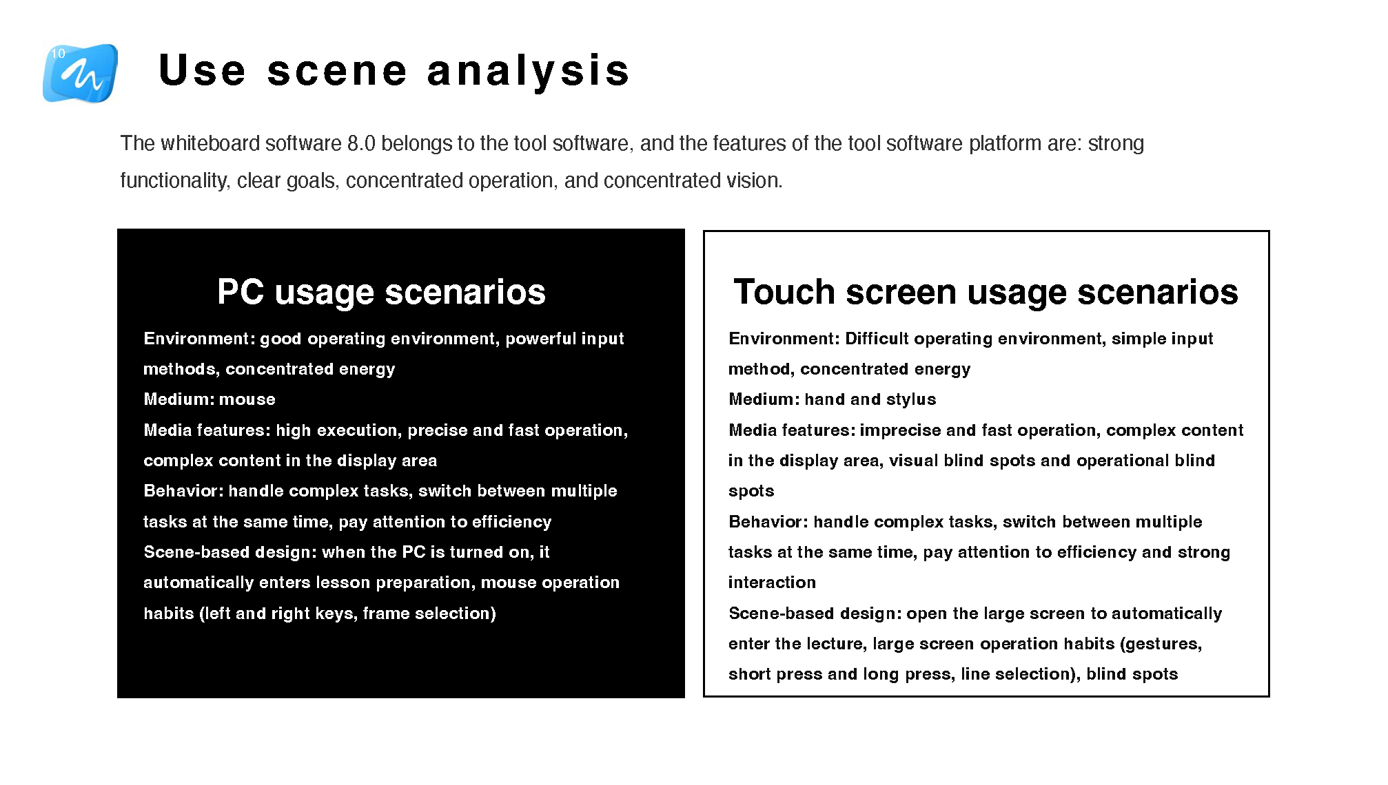
Research spanned two distinct contexts: PC-based lesson preparation and large touch-screen live teaching.
Stakeholder map
The project considered teachers, students, lecturers, maintenance, policy, competition standards, and market context together.
Scenario analysis
PC and touch-screen usage required different interaction logic and environmental assumptions.
User behavior analysis
The redesign connected user actions, emotions, and opportunities across preparation and classroom teaching.
Questionnaire findings
Survey results helped prioritize the functions that most urgently needed improvement.
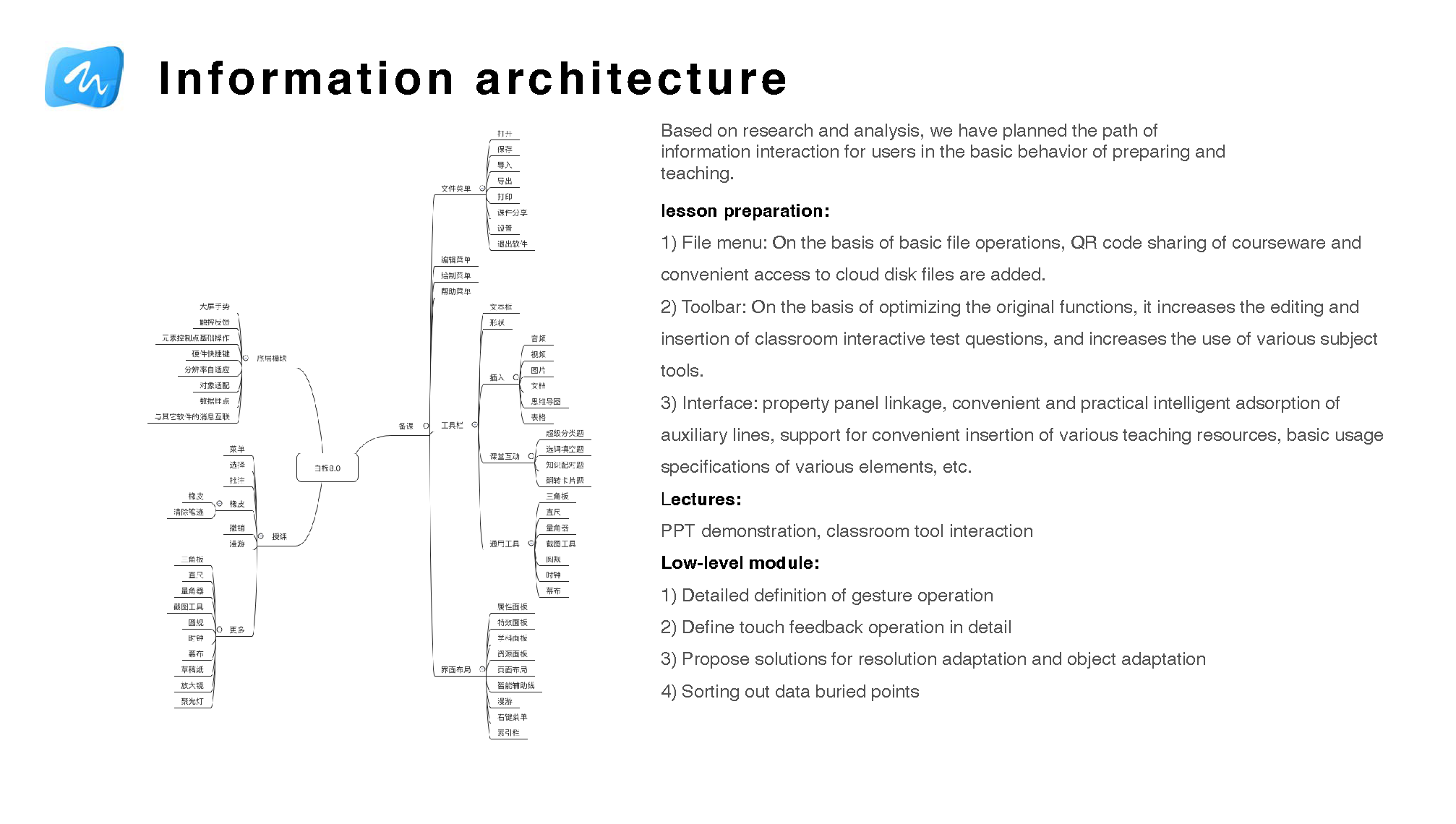
Information architecture and interaction specification
Research findings were translated into a full interaction specification covering both lesson-preparation and live teaching contexts — each requiring distinct mental models and interaction logic.
The lesson-preparation redesign addressed the file menu, toolbar behaviour, QR-code courseware sharing, cloud file access, classroom activity editing, subject-specific tools, property panel binding, and element-level interaction rules.
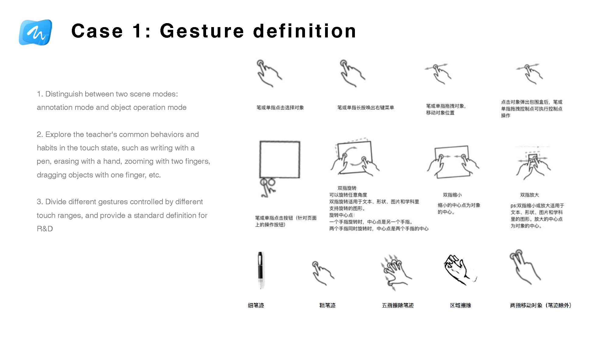
At the component level, I defined gesture rules, touch feedback states, resolution and layout adaptation logic, and instrumentation points for post-launch behaviour tracking.
Information architecture — Interaction flows were mapped separately for lesson-preparation and live classroom teaching, reflecting the distinct mental models of each context.Gesture specification — Touch behaviour was standardised into a consistent rule set, reducing ambiguity for both teachers in the classroom and engineers during implementation.
These research findings directly changed the interaction rules I defined. For example, gesture behaviour had to become more predictable and easier to discover, because teachers under classroom pressure would not tolerate ambiguous touch feedback or multi-step tool logic. I also treated cross-screen and mobile-linked actions as a way to reduce podium-bound teaching behaviour and make interactive control feel more natural in the flow of a real lesson.
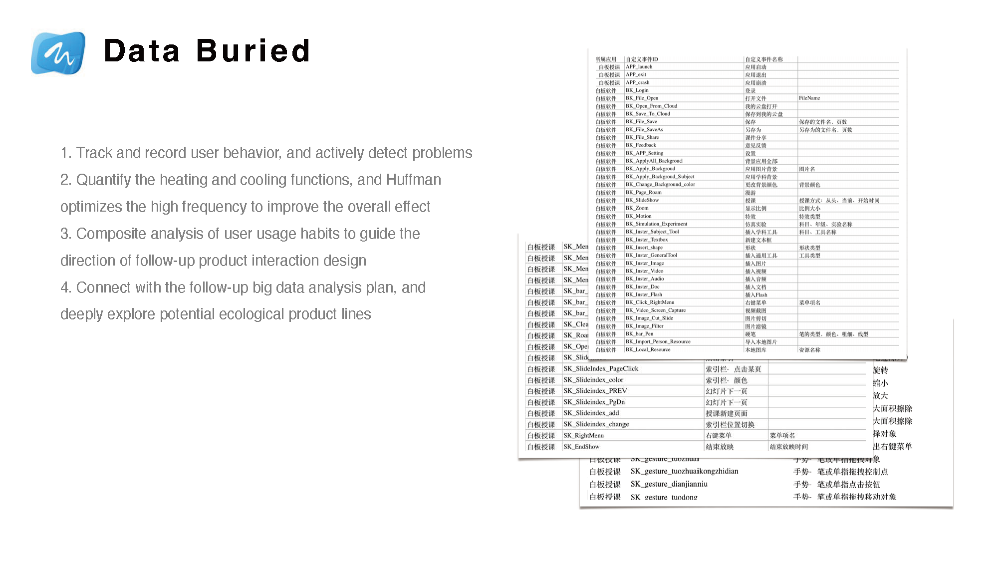
Instrumentation and behaviour tracking
Behaviour tracking was designed into the interaction model — not added after the fact, but specified alongside interaction rules as a structural requirement.
Instrumentation identified high- and low-usage features, validating design assumptions and surfacing where users were abandoning workflows.
Usage data informed the next iteration cycle, closing the loop between field research, interaction design, and post-launch improvement.
The instrumentation model was designed to support longer-term product analytics and ecosystem-level data strategy.
Interaction work was connected to behaviour tracking and later product analysis, not only screen-level polish.
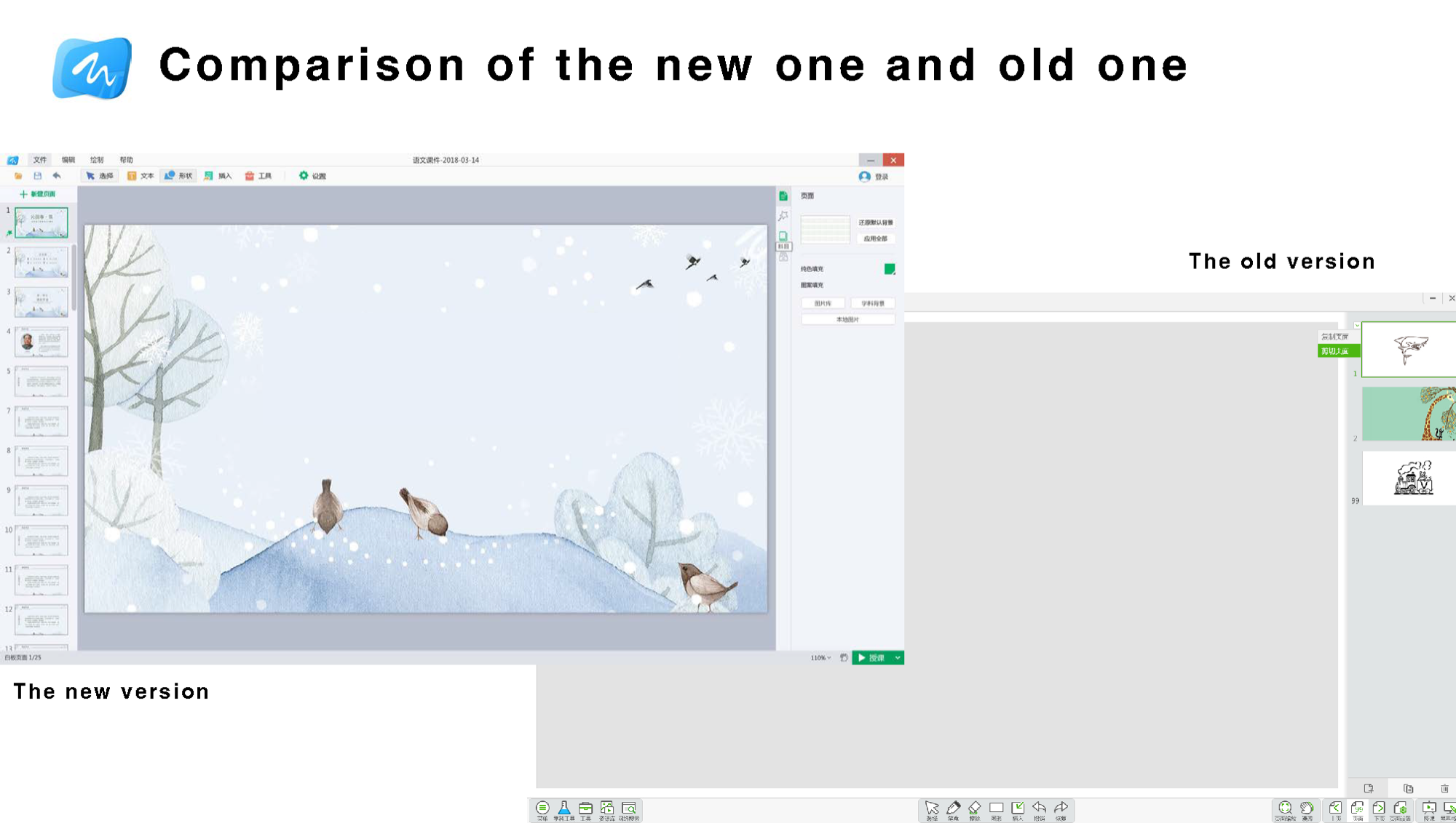
Before and after: interface redesign outcome
The redesigned Whiteboard 8.0 brought the teaching canvas to the foreground and eliminated sidebar complexity — a direct outcome of the interaction simplification goals identified through field research and usage instrumentation. The old version buried teaching tools behind dense controls; the new version made them immediately accessible in a cleaner, less distracting environment.
Multi-screen Interaction 2.0
Multi-screen Interaction 2.0 was designed to free teachers from the podium — allowing them to move around the classroom while retaining full control of the large display from their mobile phone.
I took ownership of this product in December 2017 and shipped the redesign within three months. Post-release evaluation included independent tutoring institutions and internal lecturers. In a follow-up survey, 100% of 75 teachers said they would continue using the revised software in their classrooms.
Product description
Users: K–12 teachers across all subjects
Context: live classroom teaching
Platform: iOS/Android mobile phone connected to HiteVision interactive display
Scope: mobile-to-display linkage, image upload and projection, courseware remote control, and classroom live streaming
Revision strategy
Use QR-code binding to simplify the linkage-establishment process
Optimize common operations and improve efficiency
Deeply optimize the teacher's application experience
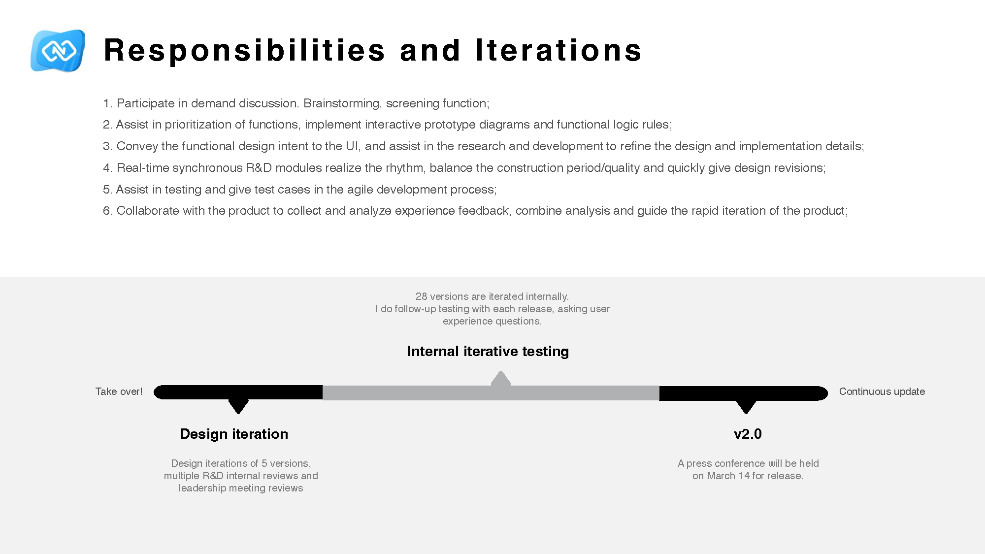
Iteration and launch support
Team structure for Multi-screen Interaction 2.0: 10 R&D, 1 visual designer, 2 PMs, 2 QA, and me as UX.
There were 28 internal versions and 5 major design iterations. I followed up on testing with each release, raised user-experience questions continuously, participated in demand discussions and prioritization, created prototypes and logic rules, aligned with UI and R&D, supported testing, and collaborated with product teams on experience feedback and rapid iteration.
Iteration work included internal reviews, leadership reviews, repeated design updates, and launch preparation.
Key design cases
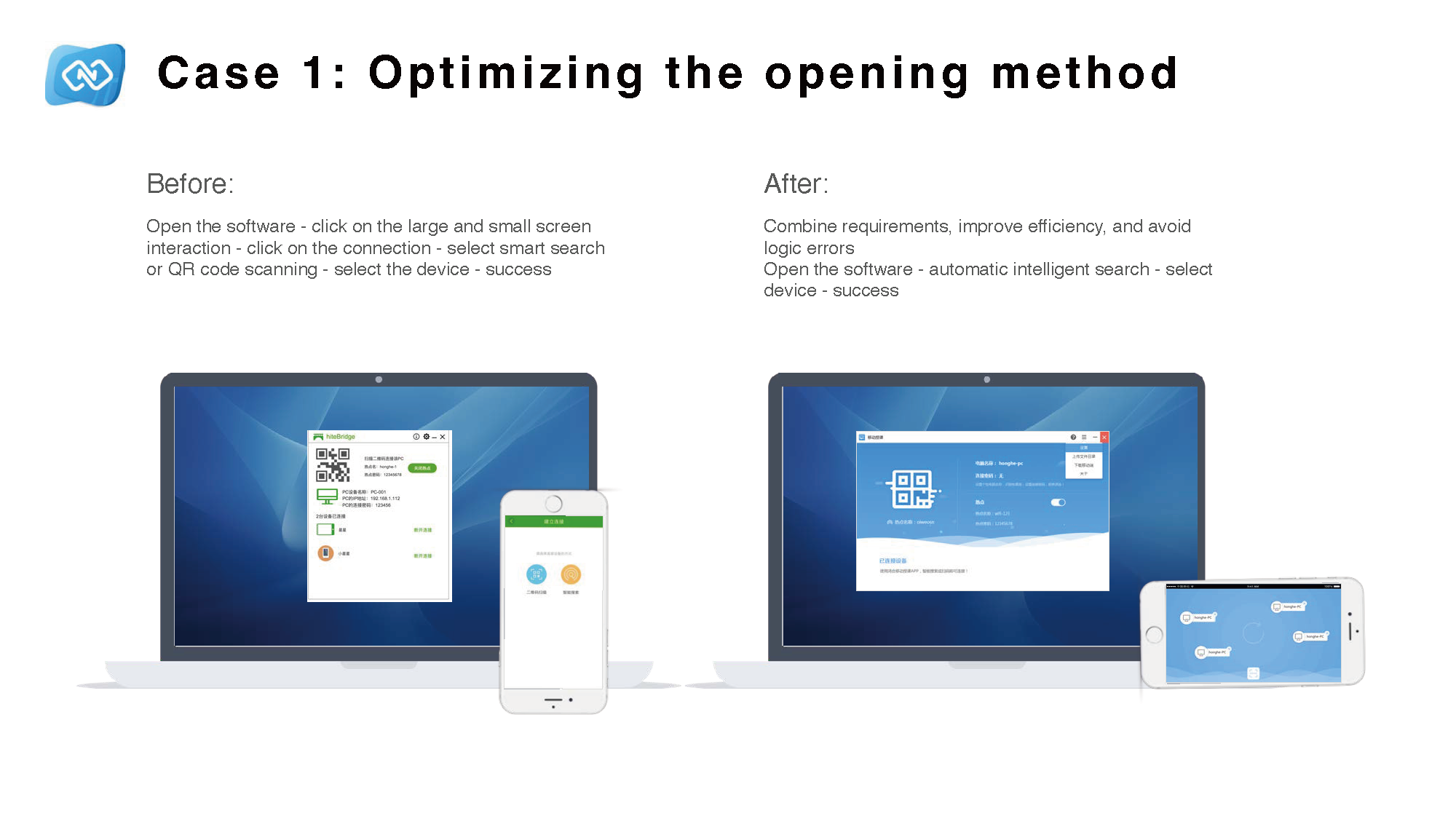
Case 1
Optimizing the opening method
Before the redesign, teachers had to open the software, click large-screen and small-screen interaction, click connection, choose intelligent search or QR-code scanning, select a device, and then connect successfully. After the redesign, the product used automatic intelligent search followed by device selection, which improved efficiency and reduced logic errors.
Connection setup was shortened and simplified.
Case 2
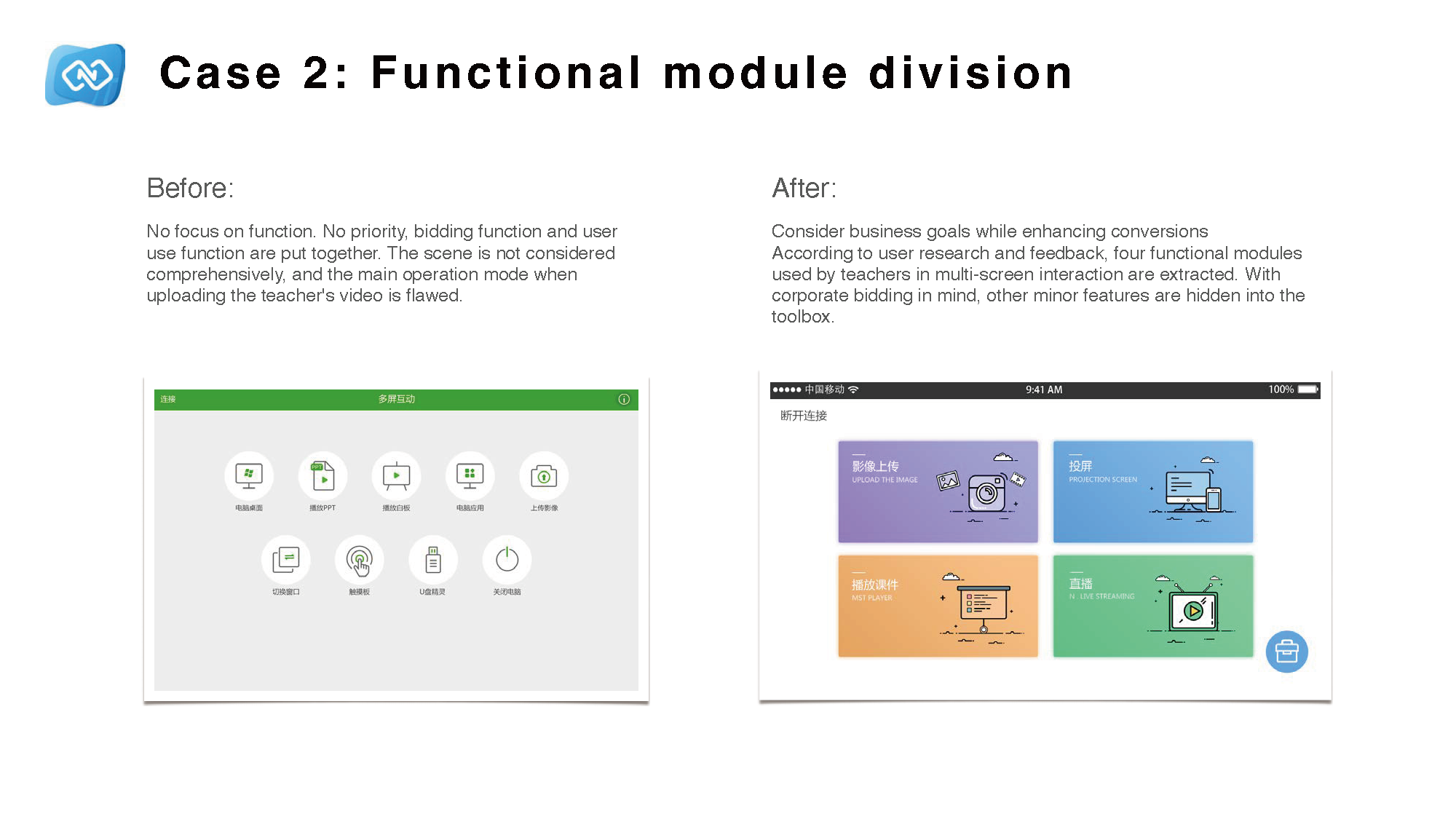
Functional module division
Before the redesign, demo-oriented features and core user functions were mixed without clear priority, classroom scenarios were underrepresented in the structure, and the primary upload workflow had usability gaps. After the redesign, four core modules reflecting actual teacher tasks were surfaced, while secondary functions were moved into a contextual toolbox.
Module grouping was redesigned around actual teacher usage.
Case 3
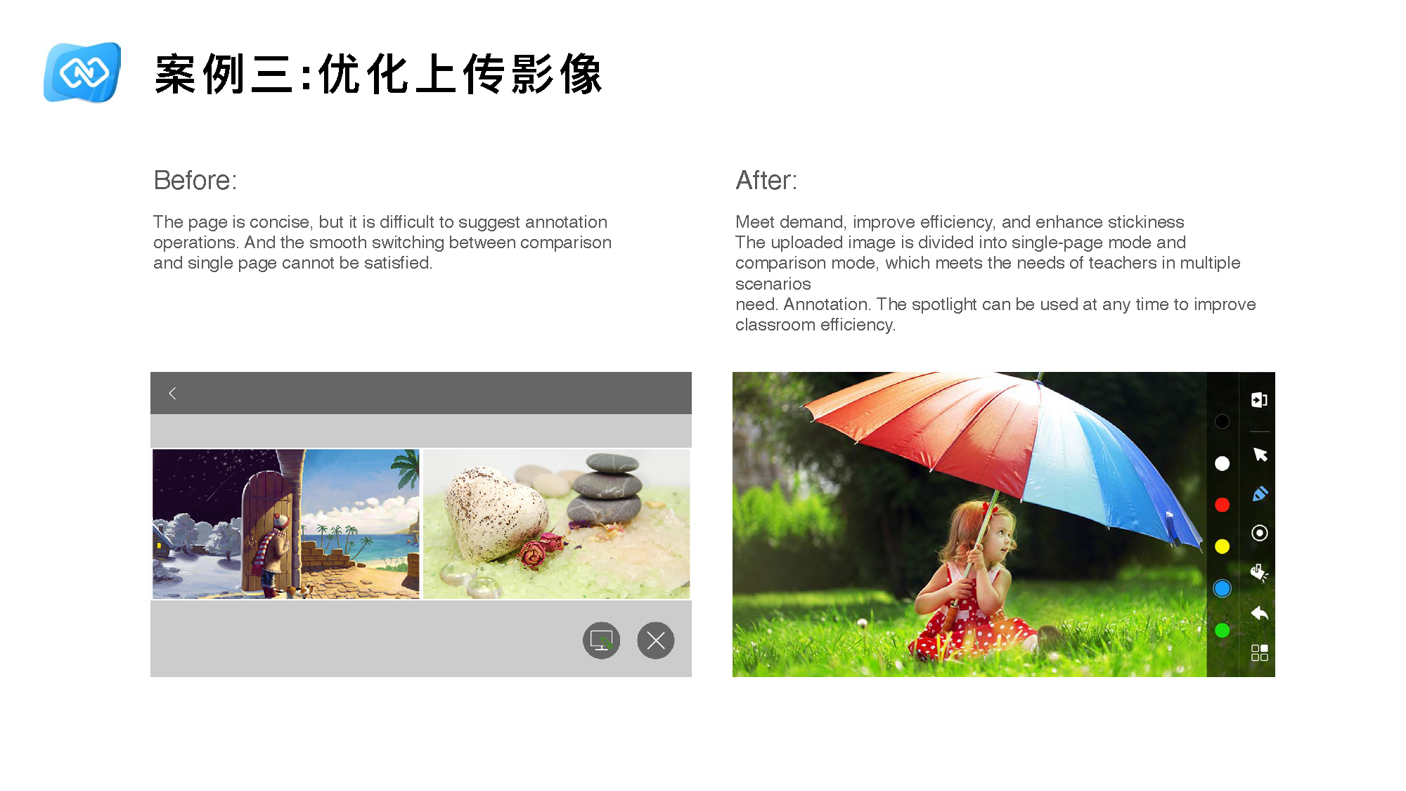
Optimizing uploaded images
Before the redesign, the page was concise but it was difficult to support annotation and impossible to switch smoothly between comparison mode and single-page mode. After the redesign, uploaded images were divided into single-page mode and comparison mode, which better supported multiple teaching scenarios and improved classroom efficiency.
Image handling was redesigned for comparison, annotation, and classroom use.
Case 4
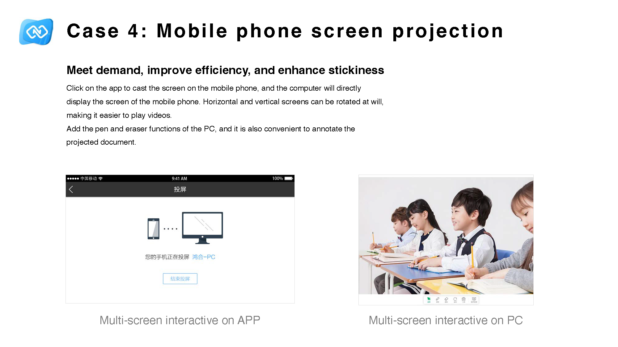
Mobile phone screen projection
I added direct phone screen projection so that clicking the app on the mobile phone would project the screen directly to the computer. Horizontal and vertical orientation could rotate freely, making video playback easier. Pen and eraser functions from the PC side were also brought in so projected documents could be annotated more conveniently.
Projection and annotation were redesigned together to support actual teaching behavior.
These design cases mattered because they reduced the interaction threshold in live teaching. In the revised multi-screen interaction product, 100% of the 75 teachers surveyed said they were willing to keep using the software, which was a strong signal that the new flow felt usable enough to stay in the classroom rather than being tried once and abandoned.
Failures and learning
This project taught me that feature richness can hide delivery failure. A product can look powerful on paper and still fail in the classroom if the interaction cost is too high for real teachers under real teaching pressure.
I learned to ask a better question: not “what else should we add?” but “why are valuable capabilities failing to cross the usability threshold for so many users?” That shift made me pay more attention to adoption, segmentation, discoverability, and behaviour in context.
It also made me more careful about designing for ordinary users, not only advanced users. Strong UX work is not just about making experts faster. It is about helping more people actually use the product well.