Author
Jun Wang writes about product boundaries, digital systems, and how a product manager redefines a website when the real need behind it changes.
Platform strategy
Writing
I put screenshots of the old website next to the new system and looked at them for a long time. The difference was not only about visual quality. The old website was a static public-facing site. The new system is a real digital platform that supports content, events, membership, and internal operations.
Jun Wang writes about product boundaries, digital systems, and how a product manager redefines a website when the real need behind it changes.
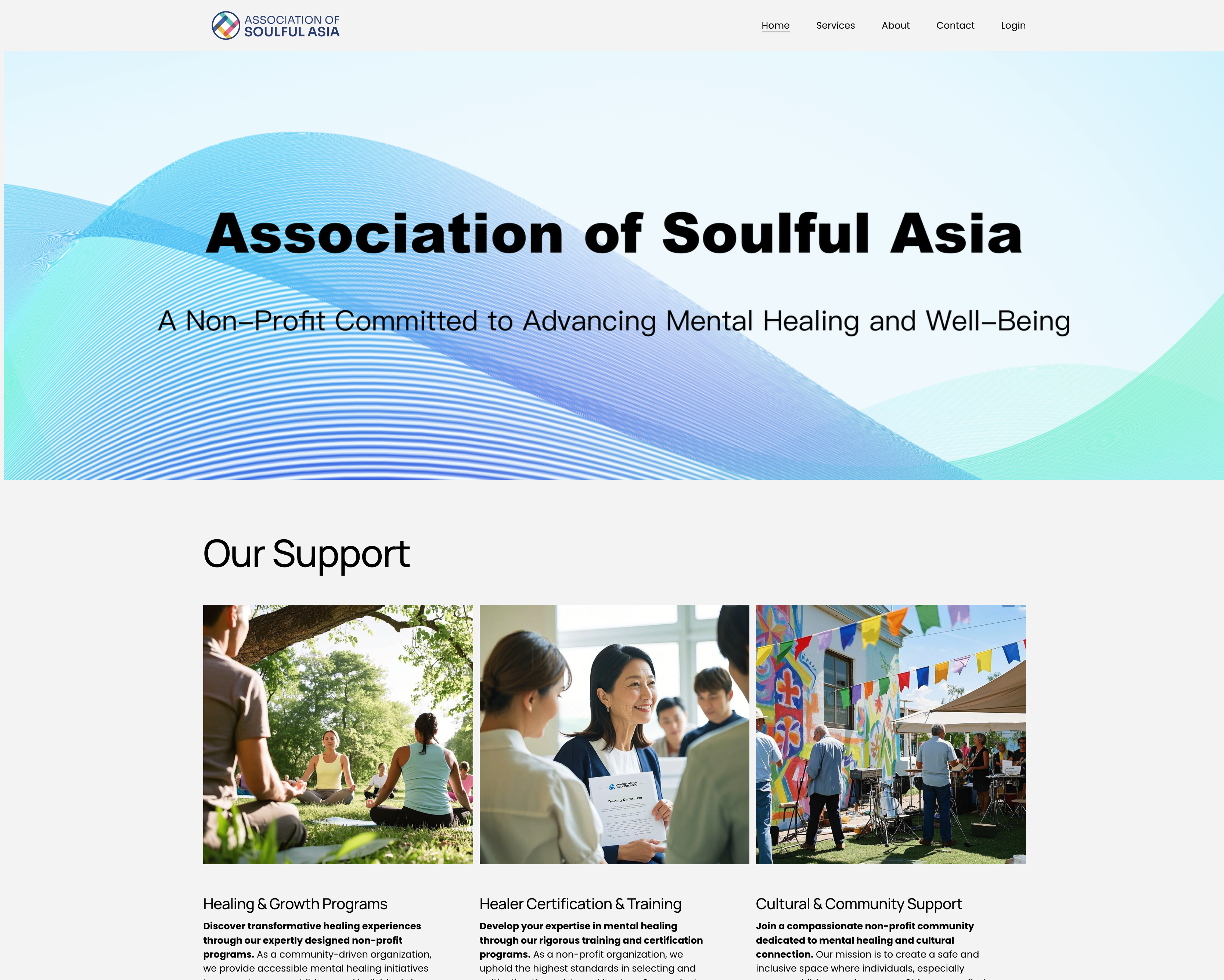
The old website was built in Squarespace. It had four pages: Home, Services, About, and Contact. There was also a Login entry on the right side of the navigation.
The homepage had a hero area with a wave-style gradient background, the association name, and a subtitle. Below that were three content cards: Healing & Growth Programs, Healer Certification & Training, and Cultural & Community Support. Each one had an image and a short paragraph.
The Services page expanded the text, but still used the same three pictures. The About page was a standard organisation introduction. The Contact page had an email address, the city name, and a contact form. The Login entry either led nowhere or went to a page with no real function.
That was all. The whole site was static, one-way, and closed. Content was written in once and then left there. Visitors could only read. They could not really do anything. The same three images appeared on both the homepage and the Services page because there was no dynamic content to fill the space.
This is not criticism. It was the most reasonable way for Squarespace to appear in that stage. The problem was not that it was poorly made. The problem was that what I really needed later was something it could not support structurally.
In Jobs-to-be-Done terms, the old website had really only been hired to do one thing: help visitors form a first impression of the association.
Squarespace did that very well. The visual presentation was clean, the information hierarchy was clear, the English was professional, and the overall brand feeling was right. For an association that had just started, that was the correct priority.
But when the association started running more seriously, I realised that the core daily workflows were all happening outside the website. Event posters were sent through WeChat groups. Journal content was distributed as PDFs. People joined as members through email. Member lists were kept in Excel. People asked about their registration status by phone or message.
The website was a shop window, but operations were happening outside the shop window.
This is a typical sign that the tool and the workflow have become disconnected. When the team starts working around the tool, it means the role of the tool no longer matches the real need.
Squarespace was not without room to expand. It had membership functions, blog modules, and forms. I seriously evaluated whether the needs could still be met inside that framework.
The conclusion was no.
The first reason was data ownership. If member data, event data, and content data stayed inside Squarespace, I would have no database access and no custom API. That would trap the data inside the Squarespace ecosystem and make it impossible to pass it into other systems such as the iOS app I already knew we needed.
The second reason was that content had become data, not just pages. The three images on the old site were repeated because the content was statically embedded into the page. Events and journal content needed a data-driven CMS, not manual page editing every time something changed.
The third reason was that the operations team needed its own workspace. On the old website there was no interface for operators at all. Event operators could not publish events through the site. Content operators could not update journal content through the site. Administrators could not manage members inside the system. Everything had to go around it.
This was not a matter of "the functions were not good enough." It was that these users had never been designed into the product at all.
After the evaluation, the conclusion became very clear: Squarespace was the right tool, but what I needed now was no longer that kind of tool.
Self-building meant time and technical difficulty. The thing that changed the equation was AI. It lowered the threshold of designing and building a full system to a level that one independent product manager could realistically carry.
The old website had only one user type: anonymous outside visitors. What mattered was their first impression, whether the information architecture was clear, whether the brand tone felt right, and whether the mission statement moved them.
The Login entry on the right side of the old navigation was symbolic. It was there, but nothing real supported it.
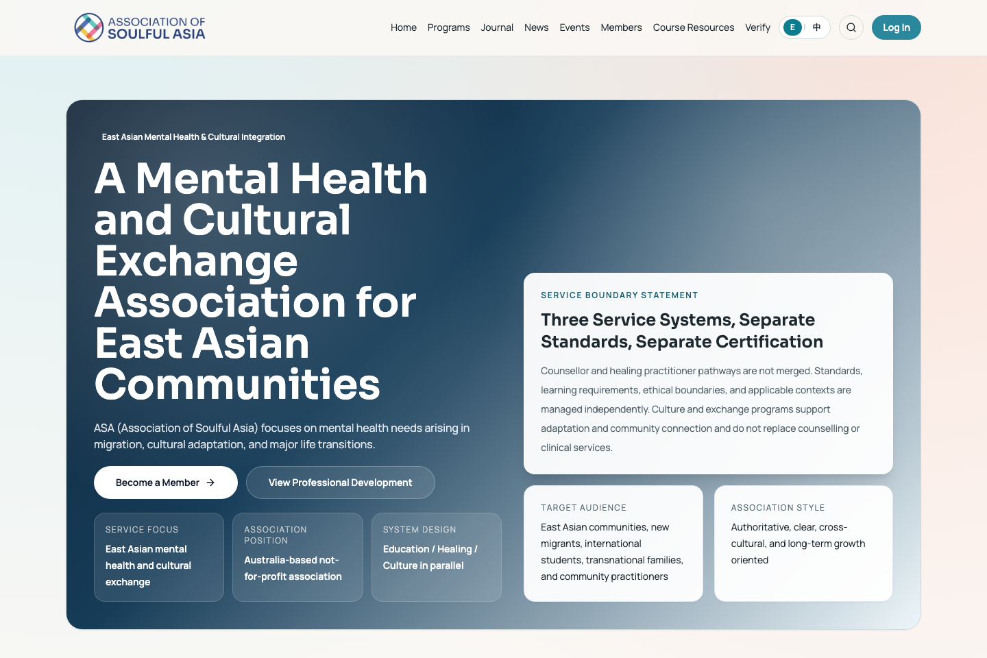
In the new system, the stakeholder map became completely different. Users changed from one kind to five: administrators, journal content operators, event operators, association members, and outside visitors.
The most important change was this: the old product only served information consumers. The new product also had to serve information producers and system managers.
Those internal users did not exist in the old website at all. Once they entered the map, the information architecture, permission system, and data structure all had to be redesigned. This was not adding functions to the old product. It was building a new product from the beginning.
The old website's information architecture was four pages with static text and images. Content was written once and stayed there. The repeated use of the same three images was not careless design. It was the natural reuse strategy of a static website with no dynamic content.
The new system's information architecture became data model plus dynamic content plus multi-end rendering.
The three service areas turned into three systems: an Events system, a Journal system, and a Member system. Together they formed an API-driven content distribution system. Data is entered by operators in the backend, then distributed to the website and the iOS app through a shared API. Content changed from static text embedded in a page into structured data that can move and be reused across ends.
At the visual layer, the change was real. The new system became more professional, more modular, and more structured than the old website. It was not only a technical upgrade. The visual system itself became clearer and more suitable for a real operational platform.
The deeper change was not visual. It was structural.
At the interaction layer, users moved from anonymous browsing to named participation: registration, login, event sign-up, journal browsing, and member-only access. At the operator layer, internal staff finally had a backend system for publishing content and managing activities. Operator experience became a direct part of user-experience quality.
The old website had mobile adaptation, but that was handled automatically by Squarespace. It was just a website shrinking into a phone browser, not real mobile product design.
In the new system, the native iOS app was included from the beginning as a design premise, not something to think about after the website was done.
This led to an API-first architecture. The backend service was designed from the start to support both the website and the iOS app. The website and the iOS app became two presentation layers consuming the same backend API.
This is also one of the deepest structural incompatibilities between the old website and the new system: Squarespace data cannot be consumed by an external app in a clean way. That is not a missing function. It is a structural limit of a closed ecosystem.
I want to say one thing clearly: AI did not think through the product for me, and it did not simply write the code for me. It acted more like a layer of translation between the two.
The product decisions were mine: what the member system should be, what the event system should be, what the workflow should be, what permissions each role should have, what to build first, and how the visual design should evolve from the old website. AI could not and should not make those decisions for me.
What AI did was translate product specifications I had already thought through into working technical implementation. From data models to database schema, from interaction logic to APIs, from design drafts to frontend components, AI reduced the time and technical barrier of turning product intent into code.
A good example is the old repeated images on the Services page. In the new system they were not "fixed" by a visual patch. They disappeared because the content model changed. Dynamic content naturally filled the space. That change came from product structure, not from a design trick.
When I look back at the old screenshots, I do not think that website was bad. In that stage, it did exactly what it needed to do, and it did it well.
What still stays with me most is this: the Login item on the old website was once just a symbol with nothing behind it. It hinted at a future membership system, but it was not a real product decision.
Now Login is the entrance to the whole system. Behind it are the database, the APIs, the iOS app's Keychain storage, member-level management, registration records, and member-only permissions.
The distance from an empty navigation item to a real digital infrastructure is the full distance between a product that only shows that an organisation exists and a product that actually supports the organisation's operation.